Before the market opened yesterday.
We'll find out if NDD and I are right tomorrow at the close of the U.S. trading day.What NND predicted was that the intraday low on Tuesday would be the low for the week, so the bottom of the current correction had already been created. I agreed with him. The proof of the pudding would be weather the markets continued to rise on Thursday and Friday. They did.
Stocks have soared again after dropping yesterday.
That was yesterday. Reuters has today's news.
The Dow Jones industrial average was up 107.74 points, or 0.97 percent, at 11,251.05, according to the latest available figures. The Standard & Poor's 500 Index was up 4.43 points, or 0.38 percent, at 1,177.07. The Nasdaq Composite Index was up 13.36 points, or 0.54 percent, at 2,506.04.Two days up in a row works for vindicating NDD. Even so, the Dow was down 1.5% for the week.
Also, Tuesday up and Wednesday down does look like a dead cat bounce.

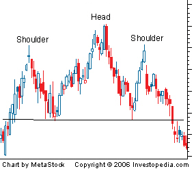
Hat/tip to cieldumort on LiveJournal for this image.
The past two days up, though, looks like the start of what I expect to be the right shoulder of a head-and-shoulders formation, indicating that the high in late April was indeed the top of a two-year bull market. First, the classic head-and-shoulders formation from Investopedia

Next, the S&P 500 since 2000. Pay attention to the far right of the graph. The left shoulder formed in early 2010 when the index couldn't break through the 1200 level, then declined below 1100. The head formed early this year when the S&P 500 rose above 1300, then declined gradually at first, then precipitously.

If this is the start of the formation of a long-term head-and-shoulders pattern, then the S&P should rise to about 1200 this year before declining to 1100. After that, I make no guesses. After all, I'm just an amateur.
With respect to the Chief Motie, the proposed correlation between the model Head-and-Shoulders graph and the S&P 500 since 2000 is bogus. If you look at and financial history graph, you can see this triple-apex shape in many places, at many resolutions. It's just a shape, and an attempt to infer an outcome based solely on this one number is artificial.
ReplyDeleteOn the gripping hand, even though Past Performance is not guaranteed to be a predictor, it's instructive to look at the S&P 500 since it's inception. Check it out:
http://en.wikipedia.or/wiki/File:SP500FF.svg
If you ignore the period between 1994-2004, it looks like one giant climbing log curve.
I'm not saying it is, mind you, but that inference is just as valid as the shoulder one.
Welcome back, Narb! That's the kind of constructive criticism I need here. After all, I'm just an amateur when it comes to the stock market--not that the professionals are doing much better. :-)
ReplyDeleteNarb likes pretty pictures. And jello.
ReplyDeleteHow about pretty pictures of Jell-O?
ReplyDeleteYou might be an amateur but I don't know squat about economics or the markets. ;-)
ReplyDelete@Narb I created a post just for you.
ReplyDeletehttp://crazyeddiethemotie.blogspot.com/2011/08/this-ones-for-narb.html
@Dusty I've been following economics blogs for four years now. I've been following the markets for 30, ever since I discovered Louis Rukeyser on PBS. I may not be much of an investor (if I invest in anything, it's real estate, something I need to blog more about), but the stock market makes for great entertainment.