A blog about societal, cultural, and civilizational collapse, and how to stave it off or survive it. Named after the legendary character "Crazy Eddie" in Larry Niven and Jerry Pournelle's "The Mote in God's Eye." Expect news and views about culture, politics, economics, technology, and science fiction.
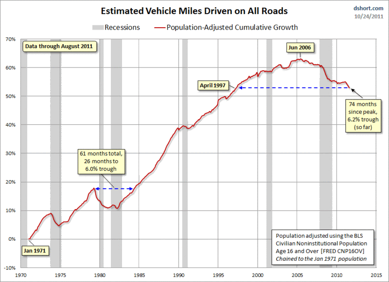
Adjusting for population, the drop in miles driven looks even more drastic than the one I presented in Return: Driving, an updated version of which I present below, and mimics the classic peak oil graph.
I've been stymied as to why the per person driving average should be so different from the miles traveled. Yes, we have continuously purchased a crapload of new cars; yes, we have built out to the 'burbs and beyond, necessitating those cars.
Maybe that's that answer. Just before the ARM bomb went off in 2008 but before anyone heard the ticking, maybe those who bought the furthest out were forced by rising oil prices to reduce their driving (consolidating trips) without reducing their miles driven (since they needed to commute anyhoo).
Which, if true, means there were a bunch more houses built and sold in the burbs around 2005 than I realized. People could afford to get them (with the dream of a quick resale as equity rose), but they couldn't afford to actually live in them, not with expensive fuel. Hrrrm.

I've been stymied as to why the per person driving average should be so different from the miles traveled. Yes, we have continuously purchased a crapload of new cars; yes, we have built out to the 'burbs and beyond, necessitating those cars.
ReplyDeleteMaybe that's that answer. Just before the ARM bomb went off in 2008 but before anyone heard the ticking, maybe those who bought the furthest out were forced by rising oil prices to reduce their driving (consolidating trips) without reducing their miles driven (since they needed to commute anyhoo).
Which, if true, means there were a bunch more houses built and sold in the burbs around 2005 than I realized. People could afford to get them (with the dream of a quick resale as equity rose), but they couldn't afford to actually live in them, not with expensive fuel. Hrrrm.
Thanks for the link.