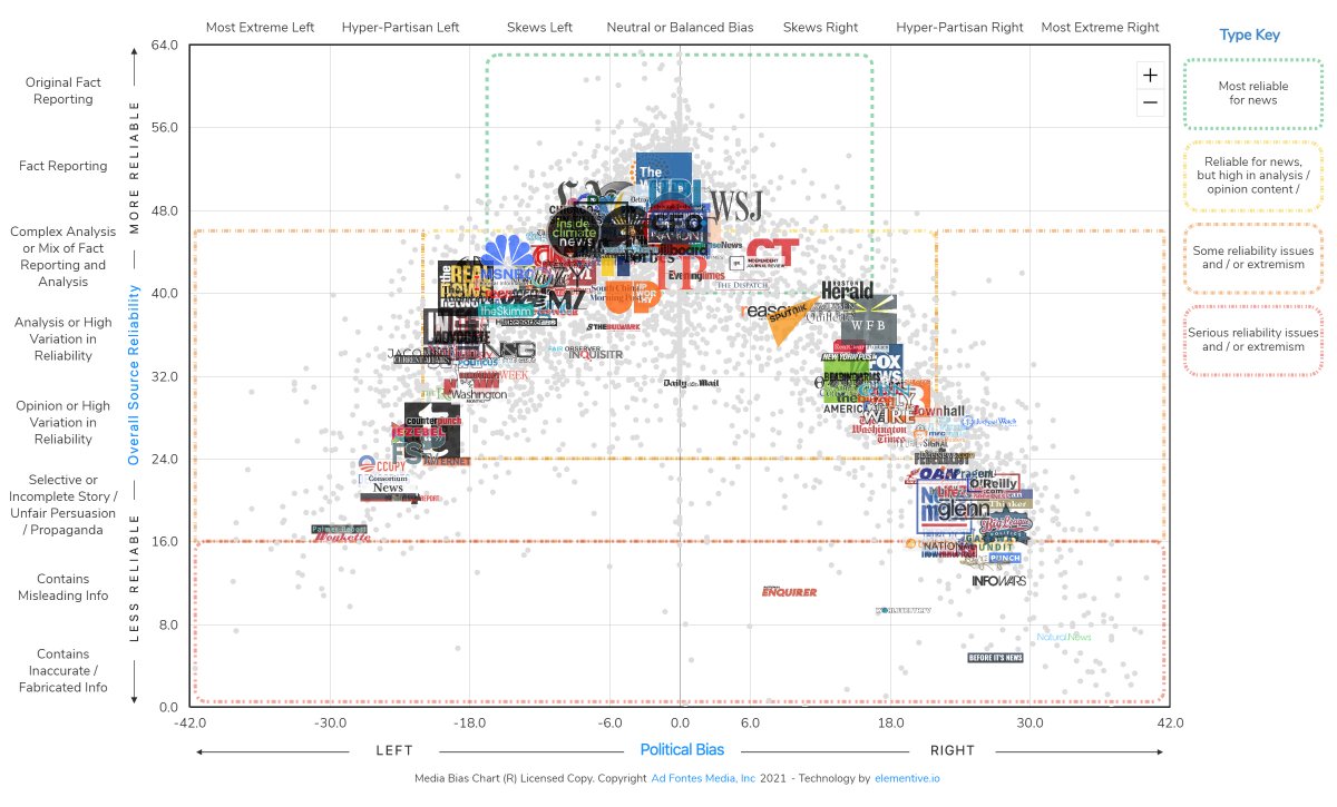
Happy Flashback Friday! I promised a much shorter retrospective today than yesterday, so I'm looking at only one popular entry today, Explaining the Media Bias Chart, a popular topic of the past two years of Crazy Eddie's Motie News. Since this post ranked among the top twenty entries last year, that means that the Media Bias Chart has been a popular topic here for three consecutive years. May this entry make it four consecutive years of popularity!
I begin with Ad Fontes Media: Fixing Our News Ecosystem, which I admit is advertising, but it does explain what Ad Fontes Media and the creator of this particular media bias chart (there are others) hopes to accomplish.
I think improving the media ecosystem through rating sources and educating consumers are admirable goals, which is why I started blogging about the Media Bias Chart three years ago.
For a more neutral examination, I'm sharing Infobase's Navigating the News Landscape with the Media Bias Chart.
There are more news sources out there than ever before, and as a result, educators face enormous challenges in teaching students how to differentiate between the reliable and unreliable ones.I enjoyed Otero's demonstration of how to teach using the Media Bias Chart. Finally, Otero demonstrates how to use the chart in News Polarization around George Floyd's Death.
We use the lens of how events are covered differently across the news landscape to discuss how coverage affects our thinking and conversations about racism, police brutality, protests, civil disobedience, riots, looting, and change.Like last year, when I embedded a comparable video about coverage of the pandemic, she showed media bias playing out in real time.
I mentioned above that there are other media bias charts besides Otero's. One of them is from AllSides. Poynter looks at both and I'm feeling a comparison and contrast post coming on. Not today, though. Instead, follow over the jump for how Explaining the Media Bias Chart, a popular topic of the past two years of Crazy Eddie's Motie News earned its page views.

Explaining the Media Bias Chart, a popular topic of the past two years of Crazy Eddie's Motie News from April 3, 2020 was the nineteenth most read entry during the tenth year of Crazy Eddie's Motie News according to default views with ~1,160. It earned 1254 raw page views mostly from my sharing it at the Coffee Party USA Facebook page to rank eighteenth overall and sixteenth among entries posted during the tenth year of the blog. The entry gained page views since April 2020, when it garnered 1,120 default and 1,175 raw page views to become the third most read entry of the month. By the end of the year, the post ranked nineteenth overall and seventeenth from 2020 proper with ~1,160 default and ~1,240 raw page views.

The original article about the Media Bias Chart, A comparison of two measures of media bias shows readers and viewers respond to both ideology and quality from August 21, 2018, had its own story this year. It earned 756 raw page views this year from web search and linking, which shows up in the graph above as two bumps during June and November 2020. While the new readers were enough to increase its total raw page views from ~9,430 to ~10,200, it barely budged its lifetime default page view count from 8,114 to ~8,120 and didn't prevent it from sliding down the all time rankings one place from eighth to ninth according to default page views and sixth to seventh according to raw page views due to the rise of Zombie Apocalypse Index for Day of the (Walking) Dead. Zombies strike again!
I have two more retrospectives planned about the most read posts before I examine comments and social media performance. Next Thursday's entry will be about entertainment and Friday's will be about the Retail Apocalypse. Stay tuned.
Previous posts in this series
- Happy International Day of Nowruz and happy 10th birthday of the blog!
- Statistics for the tenth year of Crazy Eddie's Motie News
- CDC offering zombie apocalypse tips updates 'Zombie Apocalypse Index for Day of the (Walking) Dead,' the top post of the tenth year of Crazy Eddie's Motie News for Throwback Thursday
- Broken Peach celebrating Halloween updates holidays for the tenth year of Crazy Eddie's Motie News for Flashback Friday
- Seth Meyers updates late-night talk show hosts on the 2020 election and its aftermath for Throwback Thursday on April Fools Day
- Rachel Maddow and Ken Burns on Confederate monuments being removed for Flashback Friday
- Weekend Update on Sidney Powell being sued by Dominion updates 'SNL' on the 2020 election and its aftermath for Throwback Thursday
- Noah and Colbert on vaccinations vs. a possible fourth wave of COVID update the pandemic for Flashback Friday
- The Capitol Police Inspector General's report on the preparation for January 6 riot updates Election 2020 and its aftermath for Throwback Thursday
No comments:
Post a Comment