
I mentioned my wife's car in Driving update for June 2017: Pearl plus Tesla worth more than GM or Ford.
I was hoping for fewer miles because of a week off and not having [to] make up for Dez not being in the shop, but apparently I managed to drive slightly more just the same. However, I'll have to wait until Dez passes 55,000 miles to see what the total driving impact for the family really is. That should happen late this month or very early next month.Dez passed 55,000 miles on Wednesday the 21st, so it's time for another driving update.
It took my wife 85 days to drive Dez 1000 miles, which translates to 11.76 miles per day and 358.82 miles per standard month. That's more than the average of 7.19 miles per day or 219.42 miles per standard month she drove Dez between November 2016 and March 2017. The reason for the increased driving is the same one that I cited in March for Pearl not getting a third update since November before Dez got her first; my wife drove the car to Chicago and back to visit our daughter. More of that trip accrued to this update than the last one.
As I mentioned above, the important statistic is how much both of us drove our cars. During the same 85 days that my wife drove Dez 1,000 miles, I drove Pearl 1,650 miles for a total of 2,650 miles. That translates to 31.18 miles per day and 950.88 miles per standard month. That's more than the 26.26 miles per day and 800.90 miles per month we drove between November and March. It's also more than the 24.93 miles per day and 760.4 miles per standard month we drove both cars over the comparable period last year. It's amazing how much one trip to Chicago and back affects total miles driven. Let's see if the next update shows us returning to last summer's baseline.
Speaking of baseline, it's time for a comparison of our driving habits to those of the rest of the country. From Doug Short.
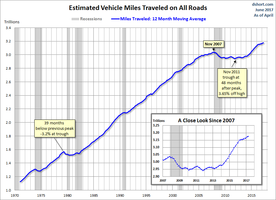
The Department of Transportation's Federal Highway Commission has released the latest report on Traffic Volume Trends, data through April.
"Travel on all roads and streets changed by 1.2% (3.3 billion vehicle miles) for April 2017 as compared with April 2016." The less volatile 12-month moving average was up 0.1% month-over-month and 0.8% year-over-year. If we factor in population growth, the 12-month MA of the civilian population-adjusted data (age 16-and-over) is up just 0.04% month-over-month and up only 0.2% year-over-year.
Here is a chart that illustrates this data series from its inception in 1971. It illustrates the "Moving 12-Month Total on ALL Roads," as the DOT terms it...The latest data point is another all-time high.
Looks like my wife and I are contributing to the trend of increased driving. That might increase more, as oil and gas prices are down year over year, but that's a story for another entry. In the meantime, stay tuned for the Sunday Entertainment Feature. I plan on writing about the Television Critics Association Awards.
I'm curious why you posted the simple miles traveled graph D. Short does, and not the population adjusted one. I find the population adjustment quite a bit more indicative of individual behaviors than the amount of cars moving about.
ReplyDeleteThat chart shows we haven't reached the per-person miles traveled since the month after the peak in conventional crude was hit in May, 2005.
That's a very good question. The reason is that I started using graphs from Calculated Risk to illustrate this series of posts years ago and Bill McBride posted only the simple 12-month cumulative miles driven graph, not the population-adjusted one Doug Short also posts. When he stopped posting those late last year, I switched over to D. Short's graphs of the same statistic for consistency.
DeleteThat written, you raised a good point. I did use one of D. Short's population-adjusted graphs in Happy Motoring in the U.S. has peaked to show the changes in behavior. I'll have to update them, as the URL for the images no longer works. Thanks to you, I might add the population-adjusted graphs to future posts in this series.