It would have been an update to Wonkette reacts to its Media Bias Chart placement, an update to 'A comparison of two measures of media bias shows readers and viewers respond to both ideology and quality', but I'm saving that for tomorrow. Stay tuned.I'll cover how this entry got its page views over the jump, but first I'm examining how the Media Bias Chart works. I begin with Newsy's Political media's bias, in a single chart from 2018.
Vanessa Otero set out to rank an ever-growing partisan media landscape, with the belief that an informed public is a better public.In this video, Vanessa Otero mentioned a revised version of the Media Bias Chart. In Ad Fontes Media Inc.'s Intro to the Media Bias Chart Definitions and Methodology, she explains how the most recent version of the Media Bias Chart works.
If you've seen the Media Bias Chart and wanted to know how we put it together here's a thorough discussion about it. Ad Fontes Media Founder and CEO Vanessa Otero goes over concepts she covers in her public talks.Of course, all stories these days are being examined through the lens of the coronavirus pandemic and the Media Bias Chart is no exception. Watch Polarization of Coronavirus Stories to see how.
We'll go through examples of news stories from over the past few weeks that show how coverage of a virus quickly turned into differing left-right narratives in the United StatesIf you watched all the videos, congratulations! You now have a good education in media literacy.
Follow over the jump for how Wonkette reacts to its Media Bias Chart placement, an update to 'A comparison of two measures of media bias shows readers and viewers respond to both ideology and quality' earned its page views.
Wonkette reacts to its Media Bias Chart placement, an update to 'A comparison of two measures of media bias shows readers and viewers respond to both ideology and quality' posted April 4, 2020 earned ~1,260 default and 1,700 raw page views by March 20, 2020, enough for it to place fourth according to both measures among entries posted during the ninth year of this blog and fifth overall. It ended April 2019 with 1234 default and 1316 raw page views, ranking it second for the month according to the first measure and first according to the second. Readers also left 12 comments during the month and year, the most comments on an entry posted both during April and the blogging year as whole and tied with Entertainment for the sixth year of Crazy Eddie's Motie News for the most comments overall during the blogging year.
In addition to being shared at the Coffee Party USA Facebook page, this entry earned its page views by Infidel753 sharing the link both at his blog and at Crooks and Liars. Thanks, Infidel! It also had views from a Disqus comment. Since Wonkette uses Disqus, I think it's a fair assumption that someone linked to my entry from there, but I couldn't find the comment, so I couldn't prove it. Darn.
That's it for this week's retrospectives. Stay tuned for something more about coronavirus tomorrow. Yes, everything is about the pandemic these days.
Previous posts in this series.
- Happy 9th birthday to the blog and Nowruz Mubarak (Happy Persian New Year) to my readers
- Statistics for the ninth year of Crazy Eddie's Motie News
- Washington Post on whistleblowing and WHAS11 on Rand Paul testing positive for coronavirus update the top post from the ninth year of Crazy Eddie's Motie News
- Michigan to mail ballots and $400 million for elections in coronavirus stimulus bill update the election news and views for the ninth year of Crazy Eddie's Motie News
- Record unemployment claims and coronavirus accelerating existing retail trends update tales of the Retail Apocalypse for the ninth year of Crazy Eddie's Motie News
I forgot to add these comments to the original post as sources of page views.
ReplyDeleteMy comment on Useful Idiots on Parade.
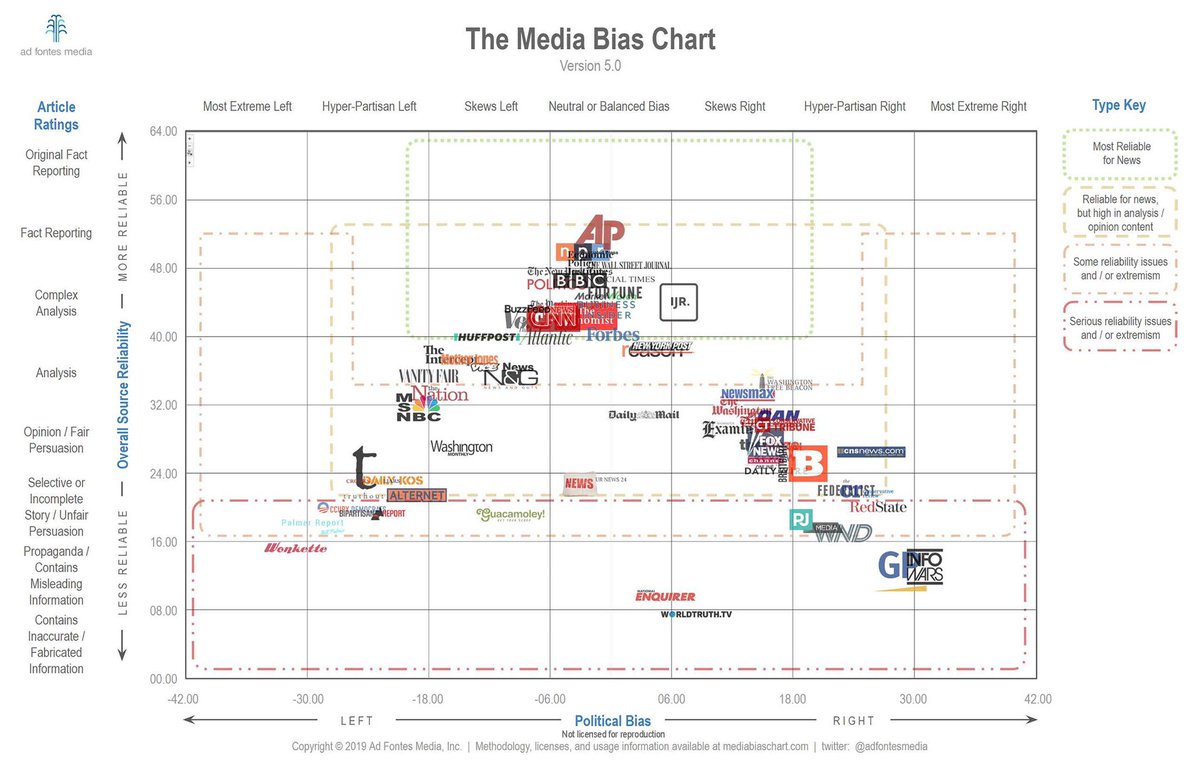
One shouldn't be surprised by Slate's take on Assange. Ad Fontes' Media Bias Chart rates the publication as hyper-partisan liberal, which means it explicitly expresses its political views, so of course the panel would take a negative view of Assange after his role in the 2016 election. As for the quality of the panel's comments, they're probably not living up to the other dimension of Slate's rating, which is complex analysis and fair interpretations of the news. Well, that's what happens when one rates the text version of the site instead of its podcasts.
Slate probably didn't contest their rating. Wonkette did, saying that the Media Bias Chart confused their satire for propaganda. The writers and editors there in particular protested that they were not to the left of Jacobin and The Intercept (speaking of publications friendly to Assange), and did not make up stuff for the purpose of misinforming their readers, just for their amusement. The Media Bias Chart kept them where they were, even if they did find Wonkette hilarious.
My comments on Wonkette reacts to its Media Bias Chart placement at Booman Tribune.
Attribution for the tip jar.
Modified from Wonkette reacts to its Media Bias Chart placement, an update to 'A comparison of two measures of media bias shows readers and viewers respond to both ideology and quality', originally posted at Crazy Eddie's Motie News.
Wonkette's placement being a case in point. The system used to rate organizations could not distinguish satire from propaganda and did not care that it couldn't. Just the same, I generally find it useful, even if it failed in this specific instance.